A control chart is an objective measurement tool used to determine if the process under inspection can reliably produce what is expected of it in the future. By examining the patterns of the data in the control chart we can understand if the process is “in control” or “out of control.” This allows us to identify whether data from the current sprint can be used to determine future performance. The less variance in the cycle time of an issue, the higher the confidence in using the mean as an indication of future performance.
Cycle Time vs Lead Time
Cycle time is the time spent working on an issue. Most commonly, this is the time taken from when work begins on an issue to when work is completed, but it also includes any other time spent working on the issue.
Lead time is similar to cycle time, but it is the time taken from when an issue is logged (not when work begins) until work is completed on that issue.
For the below example, we’ll pretend there are 4 statuses in our Jira workflow.
- Backlog
- In-Progress
- Review
- Done
In this case, we can define these terms as:
- Cycle time = In-Progress + Review + Done
- Lead time = Backlog + In-Progress + Review + Done
How to Read a Control Chart in Jira
The Control Chart in Jira shows the Cycle Time (or Lead Time) for your product, version, or sprint. It takes the time spent by each issue in a particular status (or statuses), and maps it over a specified period of time. The average, rolling average, and standard deviation for this data are shown.
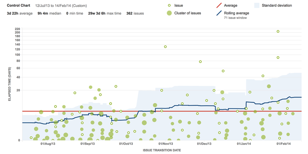
- Green dots – represent Jira issues and are displayed as a scatter plot based on issue completion date and time to complete. Darker green clusters represent multiple issues.
- X-axis – marks the issue’s transition date out of the selected statuses in your Jira workflow. In the above example, only In-Progress is selected but you can easily select multiple statuses to aggregate the data.
- Y-axis – shows the elapsed time (days) for an issue being worked on in the selected statuses. The lower the numbers the better.
- Red line – represents the average amount of time it takes the team to move an issue through the selected statuses. In this example with In-Progress selected, it takes the team an average of 10 days for items In-Progress.
- Blue line – is the average cycle time.
- Shaded blue area – is the standard deviation between the individual data point and rolling average. More predictable teams have a narrower blue shaded area as each issue’s cycle time is closer to the rolling average.