The Release Burndown Chart provides a visual representation of completed work compared with the total scope of a project’s release. It offers insights on your project’s progress, as well as offers warnings to help you maintain your project’s health; you can instantly identify problems such as scope creep or a deviation from the planned project path.
In this example of a very basic Release Burndown chart, the team(s) just completed Sprint 7 and have 2 sprints remaining to complete the release based on the rolling 5 sprint average velocity. For more information on how to determine Team Velocity and calculate the Rolling 5 Spring Average Velocity, see the article on Velocity Chart.
One of the biggest disadvantages of this basic Release Burndown chart is that you cannot identify scope changes (both added or removed) just by looking at this report. We’ll cover better Release Burndown options below.
Release Burndown Report in Jira
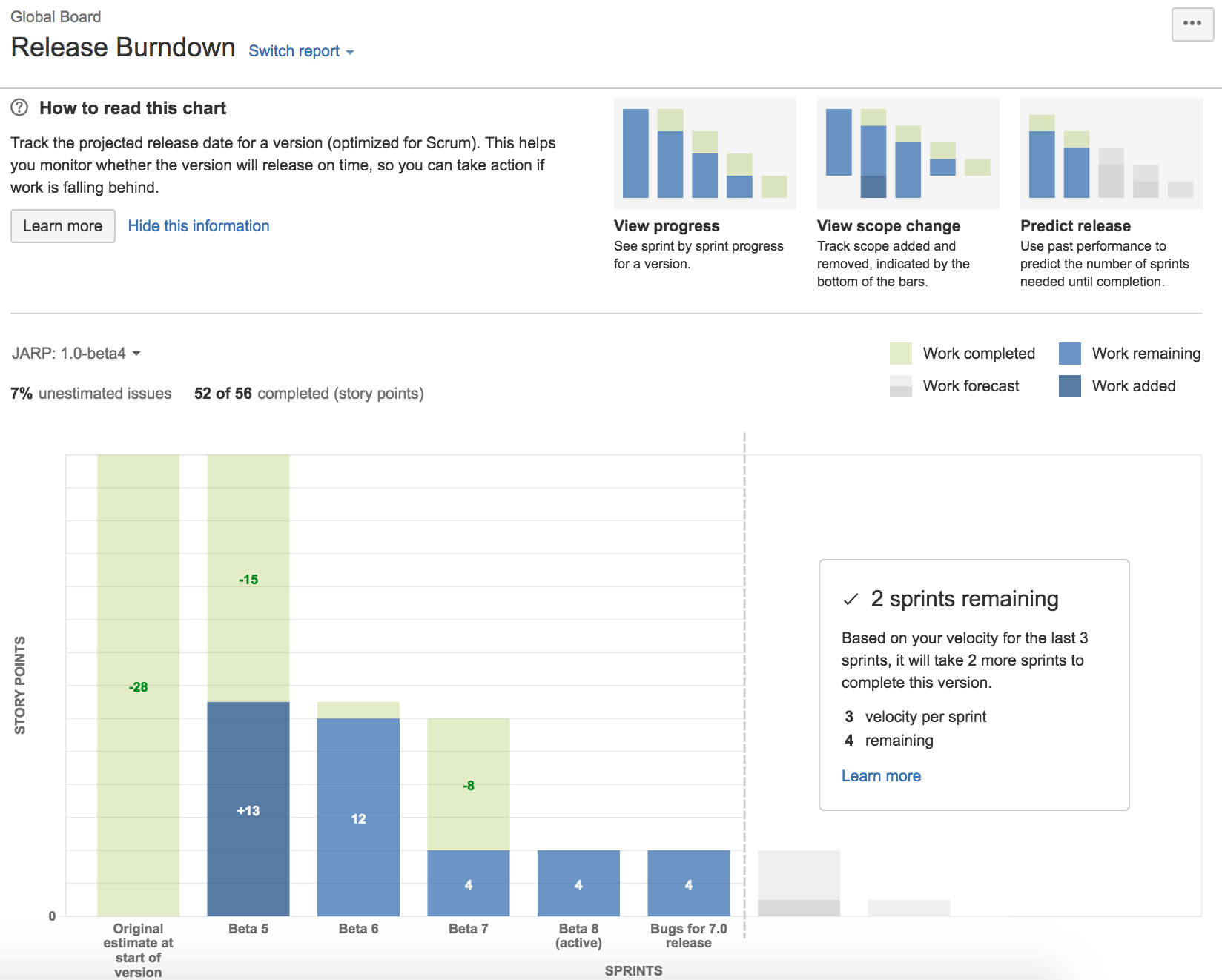
Jira provides a decent built-in Release Burndown report that that provides the below benefits:
- Automatically pulls sprint data from Jira
- View scope changes
- Predict number of sprints remaining for the release based on past sprints and changes during the sprints
Enhanced Release Burnup using EazyBI for Jira
EazyBI provides more advanced Burndown/Burnup Charts for Jira that automatically forecast predicted completion dates and allow you to drill deeper into scope that was added, completed, and removed. The below example Burnup Charts are visually easier to interpret and provide some of the below benefits:
- Easily identify scope changes (story points history)
- Easily identify predicted version vs actual burnup
- Select additional dimensions (i.e. select multiple releases, issue types)